
Homewood Health
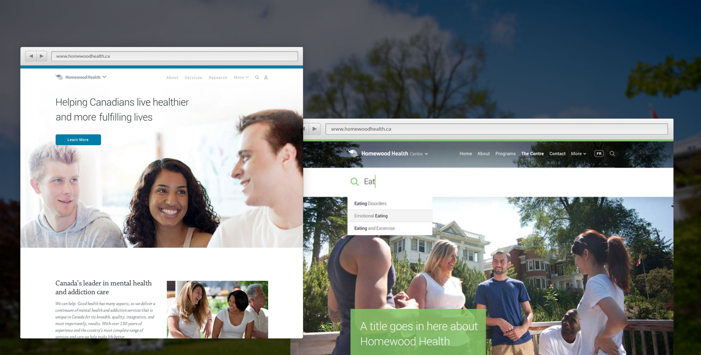
Homewood Health is a leader in mental health and addiction services, with over 130 years of experience and a network of nearly 4000 employees and clinical experts ready to deliver care and support.
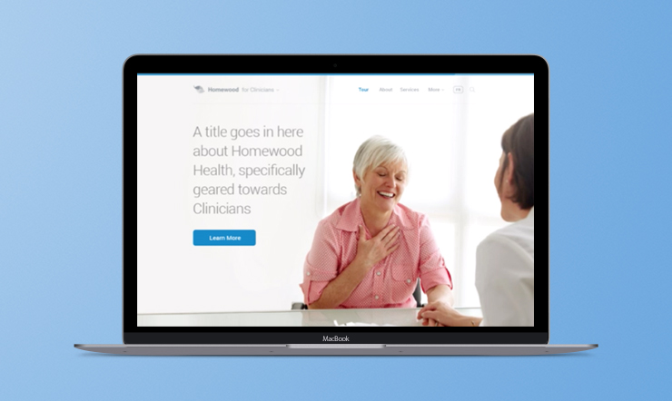
Having recently consolidated product and service offerings under the Homewood Health brand, the company wished to redesign their online site to help patients, clients, and doctors discover and engage with their services.
My Role
Product Management & UX Design
Project Team
Design Lead: Brian Pullen
Visual Design: Sheira Aryev
Tech Lead: Derek Watson
Dev: Jacob Moeller
F/E Dev: Mark Appleby
Proudly made at TWG

Discovery
I led the product design team from the initial client pitch through to final implementation of this work. I led the research and discovery phases, working closely with the Homewood team to uncover a clear understanding of our target audience segments, and distilling unique value propositions for each segment.

Whiteboard photographs from one of the early working sessions I led with the Homewood team (blurred to protect confidentiality)
I then led the definition of the overall product strategy, IA, user flows, and designed the core wireframes. I collaborated closely with the Design Lead to establish the design direction, and with our Dev Lead to define and maintain the development roadmap. I then managed the project through multiple design and dev sprints through to final launch.
Reframing the question
Often clients come in with a set project proposal, and we work with them to unpack the available opportunities, and determine how we can deliver the highest degree of value for them and their users.
The initial brief for this project was to design one large umbrella Homewood site, containing all content and serving all audience types. After exploring this option with the client team, we discovered that their service offerings were so diverse and that the distinct audience segments have very different (and occasionally contradictory) motivations. We advocated for focusing on user problems and user goals, and then presenting solutions and providing value tailored to each audience.
The funnel sites we designed focus on the differentiators of Homewood’s key service offerings and products - the ‘Why Homewood’. They also seek to add value back into the ecosystem - they exist as support pages, not as marketing pages. Everyone is coming to one of these pages to try and solve a problem. It’s about people - real people in real pain. Users share a common goal - either they want to get better, or they want to help someone else get better (family member, employee, insurance client).
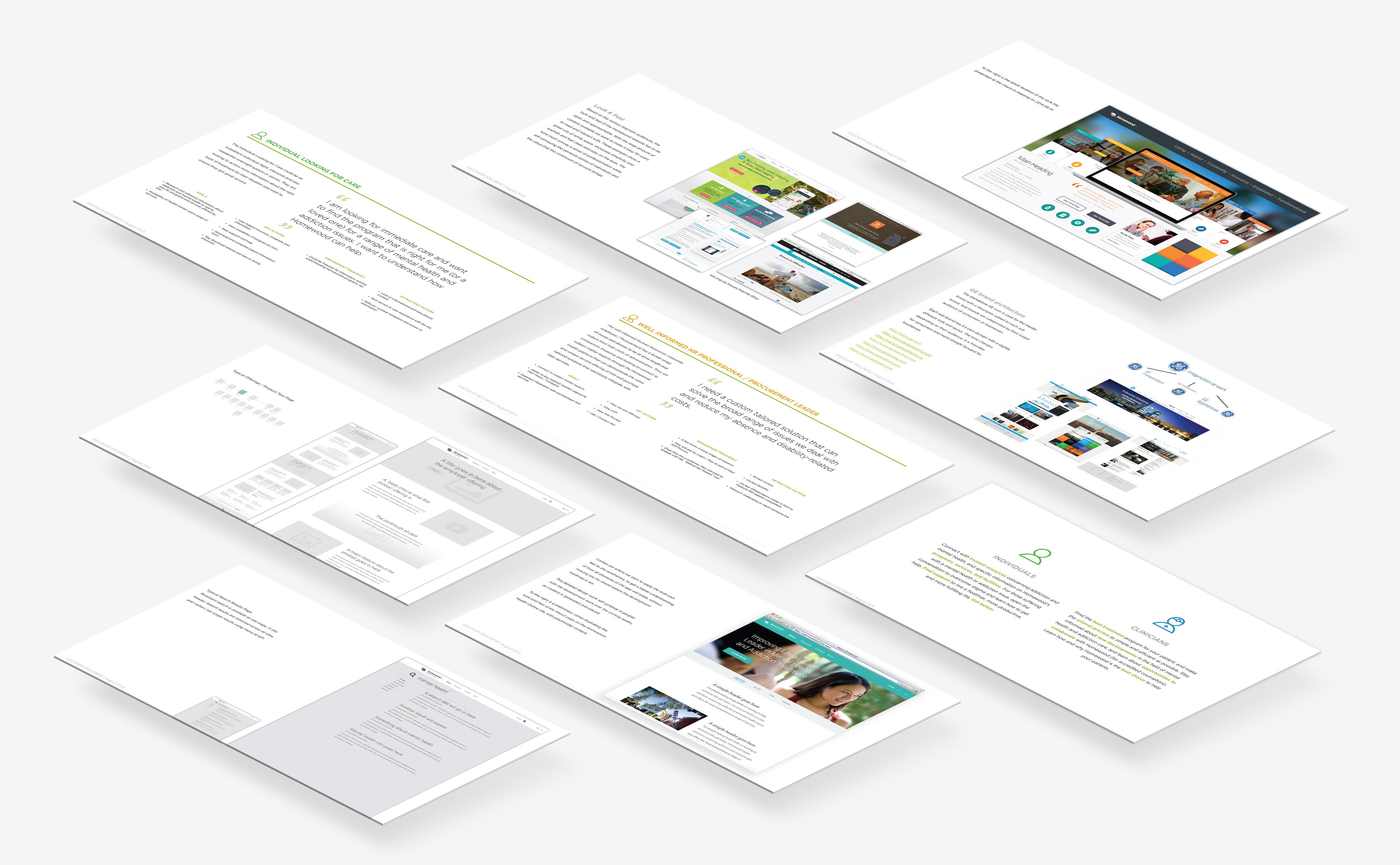

Sample pages from the project Discovery Document, laying out research, audience segments, personas, flows, precedents, visual explorations, IA, and wireframes
A modular CMS
We also recognized that Homewood's services would continue to grow and evolve, and that they would want to maintain ownership and internal control of that evolution. As such we proposed a custom CMS, using modular components as opposed to set templates. Coupled with a clear style guide and brand key, this allowed their internal design team to maintain the sites and to build new pages in a consistent style to support the organizations continued growth. This was coupled with a content plan and communication strategy prepared in parallel by another outside consultant.
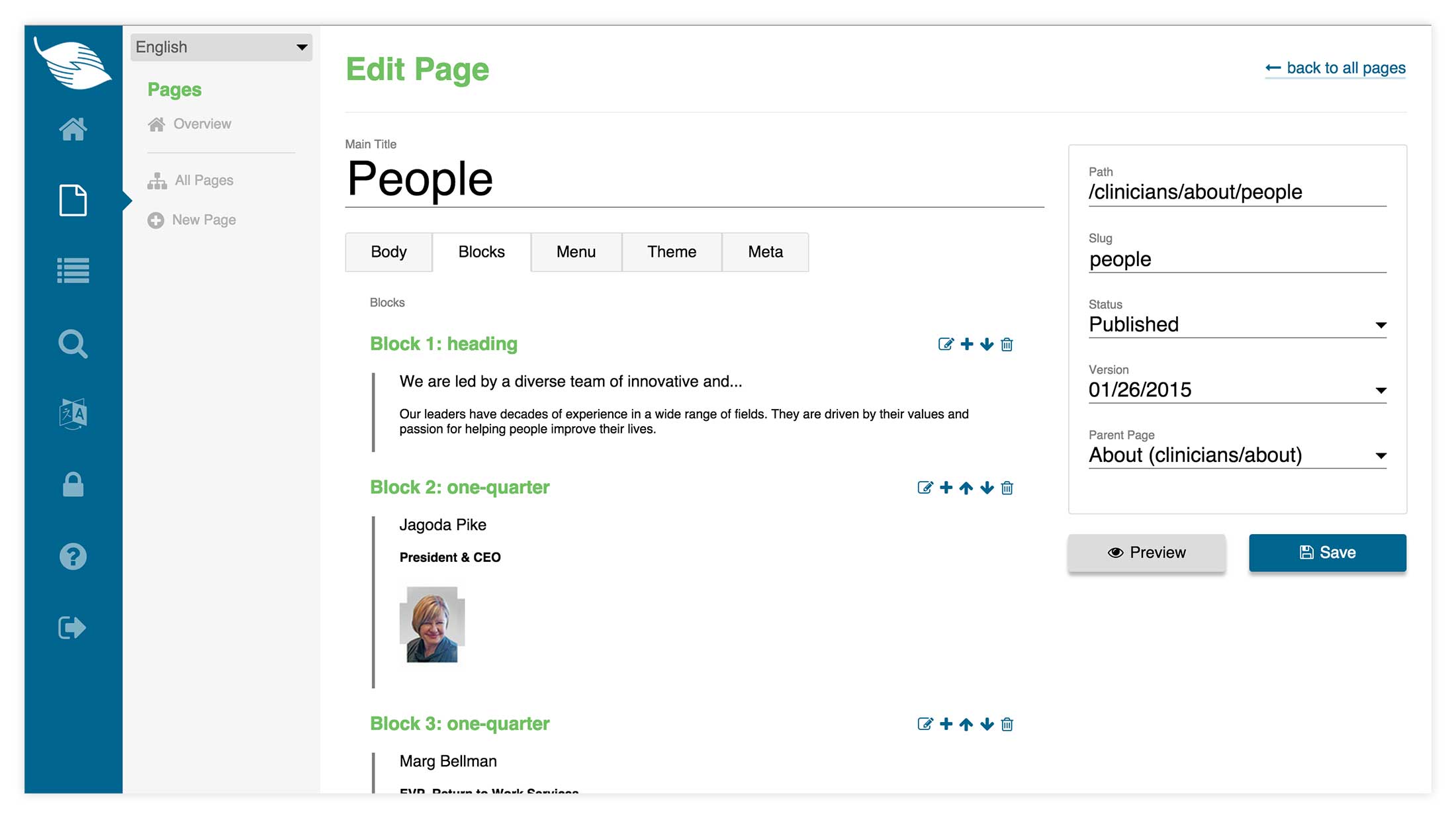

Sample view of the custom CMS back-end developed for this project, building up the site's pages leveraging modular responsive components
Brand Key
This project included a strong identity component. Hand-in-hand with the larger Homewood Health re-organization, the company was also looking to clarify their branding and market positioning. I helped lead the team through multiple working sessions to define a Mission, Vision, and Values, and to synthesize those brand values into communication principles to deliver a consistent voice across all Homewood Health web properties.
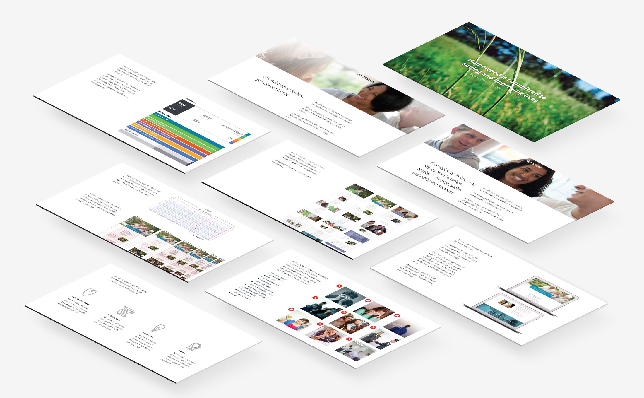

Sample pages from the Brand Book I designed, laying out the corporate mission, vision, values, service offerings, design systems, and applied uses
Along with the custom CMS and preliminary set of fully-populated pages, the Brand Book we delivered provided a set of key guidelines and recomendations for building out future pages. Users are looking for value, to understand their options, feel empowered, and then easily discover how to make further (personal) contact. Everything must roll-up to support that. The Homewood Health sites are light, spacious, and friendly. Type is designed to be friendly and easy to read. The clear communication of information is paramount.
Takeaways
I greatly enjoyed the opportunity to dive deeply here on customer journey mapping, and full service design across a very diverse collection of user types and engagements. 'Omnichannel' is a bit of a nauseating buzzword, but it's essential to think about how an expanded set of digital tools fits into an existing organization's operational and service delivery structure, and how the larger client experience can be enriched through a careful consideration of the full customer journey, including handoffs between channels.
This project was also an excellent example of how outside agencies can help clients to identify the right questions, and explore a range of solutions. As organizations refocus on their digital product and service offerings, it's increasingly essential for internal teams to maintain ownership of those products. External partners still seem to be essential in helping implement structural, organizational change.
NEXT PROJECT
Liberty Utilities
Digital strategy for an American utility company, and a series of quick wins to deliver immediate improvements to their customers